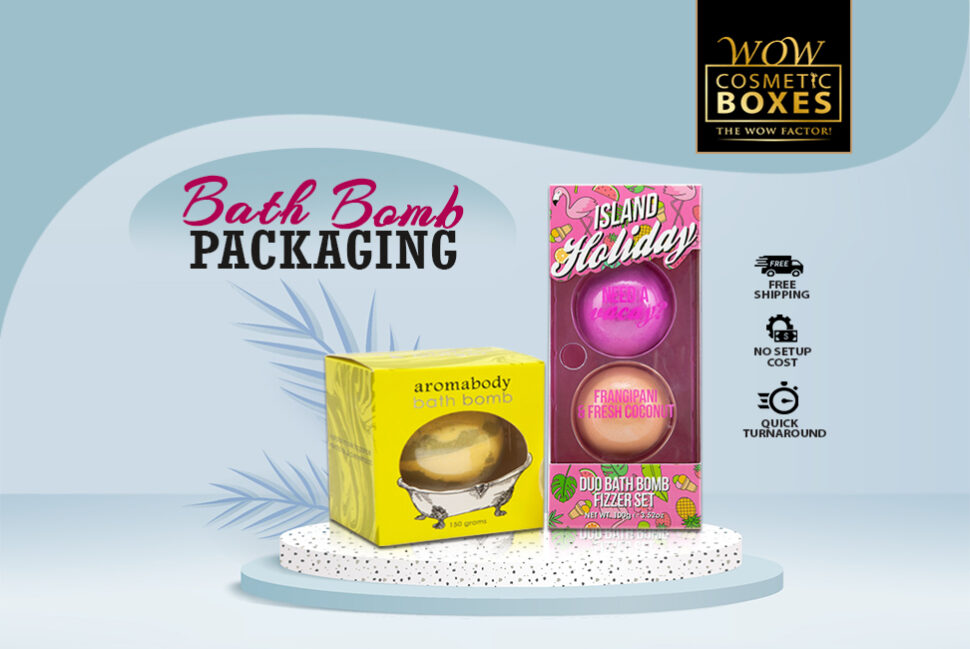
When you want to be successful in the cosmetic market, it is essential to avoid some common packaging mistakes. More and more cosmetic brands are switching from plain boxes to a customized solution, but only a few are getting it right. A small mistake can impact the customer’s perception of the brand and make you look unprofessional. Even big brands can lose the sale when a bad experience drives the customer away. It is essential to design a solution that is visually appealing and arrives at the customer’s place safely. If you are trying to achieve the above-mentioned goals with custom packaging, make sure everything is on point.
8 Mistakes in Bath Bomb Packaging to Avoid
When you invest your time and money in designing a well-designed packaging solution, it is essential to ensure that it distinguishes you from the other brands without making a single mistake. If you avoid the common problem for designing Bath Bomb Packaging, you can make your customers focus on your best side. No brand wants to give a wrong message with their products. Below are some of the most common mistakes which brands make while designing custom bath bomb boxes. These errors can make you look irresponsible, worse, and a brand that doesn’t care about the customer experience.
Excessive Packaging Fails To Add Value
When you use excessive packaging for the bath bomb boxes, it fails to add value to the unboxing experience. The use of unnecessary material only leads to a waste of money and resources. It also disappoints the customers as unboxing a product only to find wasteful material is an utter disappointment. We all know how a sustainable solution has become the need of the hour, and unnecessary material will only hurt your brand’s green image. Customer impatience, frustration, and disappointment will only result in a negative image and poor sales.
Generic Designs Are Unappealing
If you choose a design that every other brand is using, it can be difficult for customers to differentiate your brand from the rest. You have to do a good job to represent your products as unique. One of the main purposes of a customized solution is to capture the customer’s attention and make your products set apart on the shelves. The lack of uniqueness in a product design can lead to a poor first impression and low sales. It can also push customers away as they will feel that there is a lack of originality.
Labeling and Printing Error
Obvious mistakes in spelling and grammar are one of the top packaging design failures. You need to avoid all costs. It can leave an impression that you are an unprofessional brand and don’t pay attention to the little details. When it comes to buying cosmetic products, customers want everything to be perfect. Clear and precise communication is the key to build a strong relationship and win customer’s trust. Make sure to double-check all the information before printing it on the boxes.

Uneven White Space in Soap Packaging
White space has a major role to play in an effective Soap Packaging design. It is essential to consider the layout as it helps you to achieve aesthetic balance. If you don’t make proper use of white space properly, it may give the perception that too much is going on. Too much use of colors may seem vivid at first but it is a mistake to avoid. Try to distribute the white space evenly to achieve a balance. It will help you to deliver your brand message more effectively.
Not a Good Use of Simplicity Principal
We all know that how minimal packaging design is the top trend for the past few years. Keep the design simple has led many brands to success. But sometimes, we overdo something that it has to be and end up standing out negatively. All of the unnecessary details can distract your customers from the actual message. It doesn’t require a master’s degree to set your product apart with a minimal design. Keeping it simple helps elevate the customer experience and make it easy for customers to understand your message.
Choosing the Wrong Material
One of the biggest mistakes which most cosmetic brands make unintentionally is the wrong choice of the material. Pay attention to the material you are using lays the basis of the whole process. Custom boxes serve the main purpose of protecting the product, and it can’t be achieved with a low-quality material. A wrong choice will not only cost you money in the long run but also make customers think that you are a cheap brand. Cardboard and corrugate are the top choices for bath bombs.
Incorrect Box Size and Structure
Choosing the right box size and structure according to the product dimensions is essential to ensure product protection. Using a big or an oversized box will only mislead customers. It may trick them the product is too big. You also need to pay close attention to structural engineering to choose the style which suits your product the best. Don’t use a too big or too small box as both can lead to product damage and a bad customer experience.

Non-Recyclable Custom Printed Lip Liner Packaging
Sustainability is the biggest concern of Eco-conscious customers. You cannot deliver your product in non-recyclable packages as it will portray your image as a brand that doesn’t care about environmental pollution. Being sustainable will help you draw customers who want to contribute towards saving Mother Nature. Using Kraft boxes with your brand logo is the perfect example of minimal and a sustainable solution. You not only need to practice sustainability but also encourage the customers to follow the steps.
Above are some of the common design errors. Mistakes in branding and custom printed Lip Liner Packaging show a lack of attention to the details. It can result in poor sales, unprofessional image, and ultimate struggling. Make sure to provide an experience that makes customers trust your brand.

