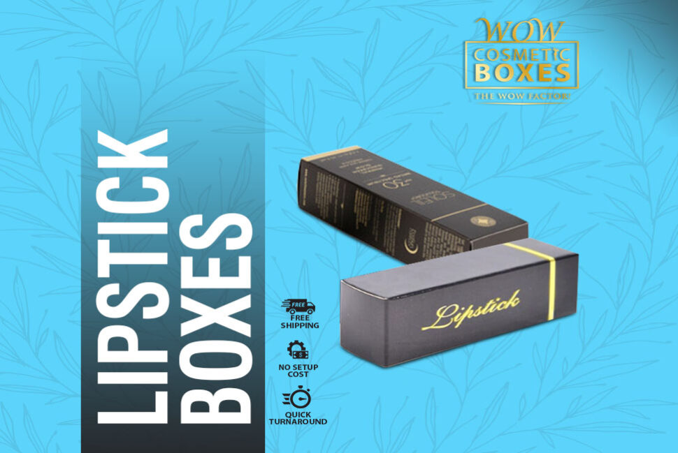
When you are in the process of creating a packaging design, you need to ensure that there is the wow factor that needs to be present in there, regardless of you having a slightly fancy Lipstick Boxes or the simple one. Because you need to have the kind of packaging that is going to appeal to your customers in any way. You just need to figure out this way. Bear in mind that there are so many countless other packaging choices besides which you will have your teeny tiny product sitting. Your boxes need to make the ideal impression. The packaging choice should be amazing enough to vie the customer’s attention. There is no doubt that your product should be a standout. Because of this particular factor, the key factor here are the way you design your packaging boxes and the choices themselves. Don’t make them too busy or too dull. There is a balance between the two that you need to find.
This is easily achievable when you take aid from difference shapes and unique designs. All you need to do is figure out a shape, design and style that will blend perfectly with your product to grab the attention of your audience.
You need to go for there and use color variations to make your product packaging pop out. You need to create appealing color schemes that will grab the attention of your customers. However, before you do that, let’s have a look at some things on the basis of which you can base your selection:
- You need to consider your customer’s mindset. For instance, you need to know the age you will be targeting. At the same time, the demography and gender also needs to be considered. Let’s say that you have a product that you are targeting to people of all age groups. If that is the case, then you need to somehow ensure the color selection needs to be something that will not bore the young minds or offend the elderly.
- Every manufacturer has a message in mind that they wish to be conveyed to their audience. That can be done through the packaging. Therefore, you need to know the message that you are trying to send to your buyers. But at the same time, you need to be sure that you have chosen a color that is portraying the end goal in an idealistically amazing manner. This goal of course is to make the customers buy your items.
- Every packaging design that you are going to create will have a CTA (Call to action). This CTA clearly reflects the thing that you wish for your audience to do as they set their eyes on your product.
- You need to have a design along with a set of colors that can play with your customer’s feelings and emotions. In needs to be done in a way that they immediately want to buy your product.
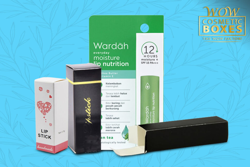
Now that you have an idea about all the amazing things the colors you choose should be able to do for your product packaging. We have further broken down the things certain colors have the ability to do. Since the colors have the potential of evoking different kinds of emotions and feelings, you need to know those which tones can do what. Have a read to know how colors can help you make your packaging better:
- The color white represents innocence, equality, peace, and purity. When you use white color in your packaging, it is reflecting all those emotions and feelings. White is also a reflection of simplicity which is being shown in your packaging. But at the same time, you can tell that a packaging is classy because you have used white in it. In short, when you use white, there are a lot of amazing and adorable feelings that can be evoked through the color.
- You manufactured a product that have a kind of authority factor to it. Maybe perhaps some kind of power that your product represents. If that is the case, then its black you need to go for. Because black is the best color that reflects power, authority and command. Those brands which use black in their packaging are creating a strong feeling of firm authority of their products over other brands.
- Red is a color of love and romance. But at the same time, it evokes thrill, suspense and excitement in others. It stimulates the mind into feeling overly excited and thrill. So brands need to reflect these feelings and emotions through the color of red in their packaging choices.
- There are times when a product is all about balance, calm and harmony. This thing needs to be reflected through the packaging too. Therefore, to develop this sense, it’s green that you need to go for.
- Onlookers are sometimes looking for some fun and adventure. This can be done through orange. Choosing this color will make your customers feel quite adventurous.
- Blue represents safety, security. Will you want your customers to feel that way, then you need to go for this color. At the same time, you should know that this is one of those colors that has a great sense of appeal for both men and women. In fact, this is one color that has the ability of appealing to a huge number of people worldwide.
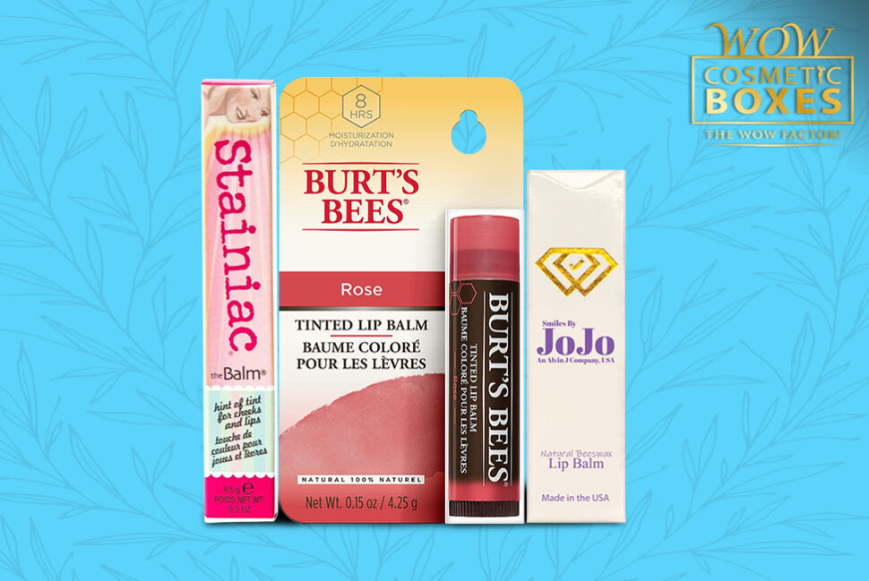
You need to go for Lip Balm Boxes that need to have a play on colors. This is the best way of dealing with your demography and appealing to them. You need to keep in mind this key factor when you are in the process of designing a packaging. Because you need customers to be attracted to your products and this is the best way of doing that.
