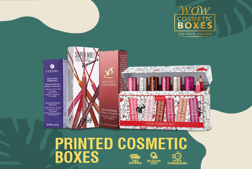
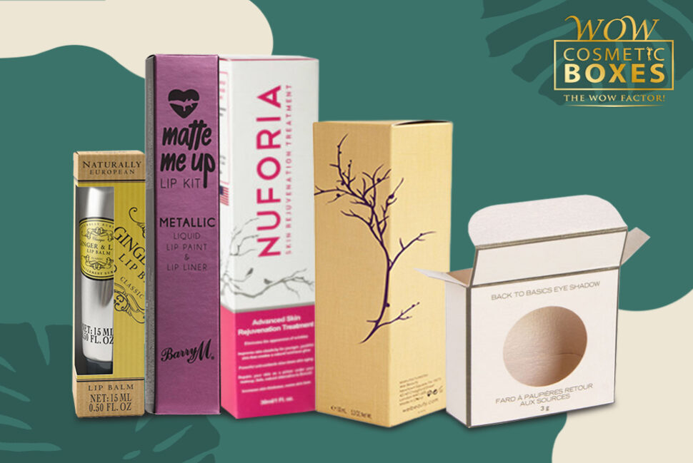
You need to know that packing your products correctly and accurately is one of the key factors that you need to consider. How come? Well, in order to make the best most probable impression in the market with your products, you need to have the right kind of packaging. Obviously, we needn’t explain to you that you are up against some seriously fierce competition. You need to make your mark. You need to set a firm foot in the industry and market to be able to survive. For this to happen, you have to attract buyers to your products. Simply put, this is not going to be an easy job for you. Because you see, there are just so many similar products other there from numerous brands trying to compete for your position. The customer has the open choice of selecting from whichever they like. Then what is it that you need to do to make them choose your product? What is that special thing about your product that will intrigue the customers to purchase from you instead of other choices in the market? These are the questions that you as a brand should be asking you. And I strongly believe that you already know the answer as well. It’s your Printed Cosmetic Boxes in which you have packed your goods. The material choices you make are considered the deciding factor for your goods. But then again, it’s more about the actual design of the packaging than the material itself.
So how about we have a look at the potential these boxes have for your brand. How these choices can help your business, what they can do for it. Furthermore, all those things that you need to do to make everything right for you.
To begin with, we need to have a look at all those things that ought to be done for the boxes that will allow you to make the right impression.
Make a Packaging That Can Pass the Five-Year-Old-Test
Have you ever heard of this test? It is one of the most classic yet important tests to be conducted in marketing that helps in ensuring that packaging can easily pass the five-year-old-test. This means that you need to create a design for your product packaging that ought to be simple and clear. It needs to be so obvious that even when a five-year-old takes a look at your boxes, it should understand completely and clearly what the item inside may be. Similarly, the child should easily be able to identify the product while it’s placed up on the shelves. Just by looking at it, the child should know.
How about we take the example of Mr. Clean. Everyone knows this brand because Mr. Clean is one of the most iconic and recognizable figures of the industry. You tell your five your old to look for this product up on the shelves and it will have no difficulty at all, absolutely none in trying to identify it.
But then again, one would think is getting into the minds of an adolescent really that important? Can’t we just do away without this factor? Well, the answer here would be yes, you have to get into their heads. It’s very crucial and important. Mainly, the kids are attracted to visuals. They tend to focus exactly on that. So to say things in simpler words, your packaging choices needs to have the most iconic look and feel.
Create a Design Taking Inspiration from the Most Iconic Packaging Choices
The next thing on your list should be soaking in inspiration to be able to come up with the most iconic designs for your packaging. For this, it would be ideal that you turn to the most iconic and phenomenal designs in the market to get as much inspiration as you can. But wait! Don’t just think of it as stealing. Because this is a wrong perception.
The only thing you are doing here is looking at the packaging design of the most famous brands in the market just to get a few ideas, a little bit of inspiration. You need to get your innovative and creative side working. You just need to be careful that you are not stealing their design or ideas. So as long as you are not doing that, you will be just fine.
Take inspiration from a design, come up with one of yours and add your own spin and twist to it. This will make the design completely new, refreshing and unique. You can take the example of Coca Cola. This multinational brand is still worth a whopping $74 billion. Have you ever wondered how they were able to maintain their position even after being in the industry for about 127 years? Did you ever imagined how they still have what it takes to beat their competition and compete headstrong? The answer is fairly simple if you ask us. They were able to do all this and more just because of the packaging choice they had. Their packaging has this unique symphony of the most ideal designing elements.
Now let’s break down their design for further consideration. We can begin by taking a look at their color choices they have used in their design. It’s red which can easily stimulate excitement. The packaging font they have used is classic. The font quite ideally fulfills the desired purpose of a bottle that has been beautifully shaped. Now pay further close attention then you might notice that the font, which is in white color, easily appeals to adults and kids both. However, there have a packaging choice that is backed by a product that has the most superior quality. You need to know that both these elements are equally important for running a successful business.
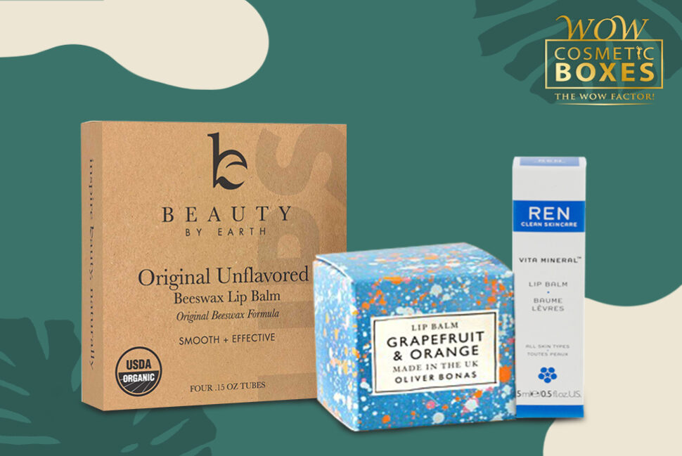
But in saying that, if you note, you will see that the brand stayed updated with its design. This is exactly why after all these years, the company still has not lost its touch.
When you apply these same rules to your Printed lip balm boxes, you are going to get the most unbelievable results. Very soon you will be a favorite of the market.
