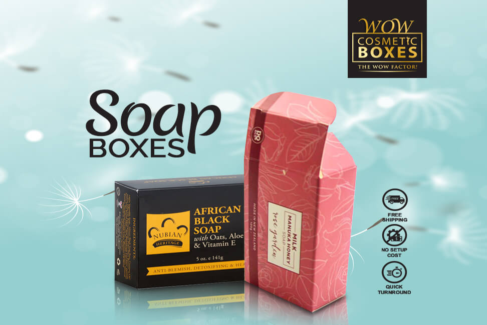
When brands do not know which features to incorporate in their packaging, they end up making a failure of choices that can practically make them shut the doors of their business. Which is why before they jump into the whole designing factors of their packaging, they need to know which are the best elements they need to consider for their Soap Boxes.
The Images Need To Be Striking
The images and photography on your packaging needs to be clear and striking. It needs to grab the attention of the customers. Plus, it needs to be in accordance to the product packed inside. You simply cannot put an image of a baby on your product that is meant for the elderly. Same way, the images need to be clear enough that it gives out the perfect reflection of the product. It needs to be clear enough. It should be of the best resolution that nothing is smudged or not visible. It needs to have that striking element that will make the customers go wow.
The Colors Need To Be Bold and Vibrant
Focusing on one color can be a bit dull at times. At the same time, too many colors too can make the head spin. Unless you have a brand identity that is all about mayhem. If that is the reflection of your brand’s personality, then you can add in a mishmash of colors to your packaging. Otherwise it would be best that you select a couple of different colors that are add the best kind of appeal to your packaging. But make sure you are making the selection based on a number of factors. Firstly, the gender and demography you are targeting. For instance, if you are aiming at women because you have ladies’ products, then you need to go with all the girly products. Same thing you need to do with the demography. The second thing you need to consider is the age group you are targeting. For instance, old people like sober colors, not funky and striking. The last thing you need to ensure is the colors you select need to go with the personality of your brand. When you combine these elements, you will easily know which colors to go for.

The Content Needs To Be Relevant and Readable
When you are in the process of selecting a font for the packaging, you need to ensure it’s readable. Brands at times want to select the fanciest looking fonts. But these are never good for their packaging. Because more than half of the time, customers are trying to figure out what’s written on the packaging. In fact, at times they can’t even make out the name of the company. It’s that complicated a font they have selected. On the other hand, if you have a look at the most famous and reliable brands across the globe, you will see they have simple or classic fonts for their packaging. Fonts that are readable and look elegant too. Take Coca Cola for instance. They have chosen a classic font which is easily read by even kids.
Moving on, the content needs to be relevant too. Nothing on the packaging needs to be inaccurate or incorrect. At the same time, you don’t need to put in a lot of information about the product. It needs to give out enough details so that the customers can figure out your product. But be careful not to mislead with your content because that is going to annoy the customers.
The Design Needs To Be Punchy and Alluring
Brands know that their design is the main feature of the packaging that is wrapping up their products. If it’s dull and boring, it can practically drive the customers away. Which is why the design needs to be striking and punchy. It needs to grab the attention of the buyers immediately. Moreover, it needs to keep hold on their attention and make them want to buy the item. That’s the key to a good design. For that, brands need to add in all the best features and trends to their design to make it the most beautiful thing. It needs to be simple in an elegant and sophisticated manner. You need to work on your design, but don’t overdo it to make it look something that can potentially give customers a headache. Make sure it’s beautiful and simple. It has the ability to allure customers. It has the potential to make sales. That’s all you need from your packaging.

The Material Needs To Be Top Standards And According To the Product
First thing’s first, you need to select the best standard material for your product. It needs to be of the best quality. Because the best quality will reflect the amazing standards of your product. Otherwise, with a low quality packaging or material that is giving out uneven, rough and unappealing surface, the customers will think that the product too inside will be the same. It will be made of the lowest quality material. And quite frankly, they don’t need a low quality product when they have countless options before them. Therefore, ideally you need to look at the material factor quite seriously.
Moreover, when you are in the process of selecting a material for your Custom Boxes, you need to ensure that is it in accordance to your product. For instance, you cannot select a lightweight packaging material for a product that is heavy. It’s obvious that when you select a heavy weight material for a heavy product, the final load of the two will be massive. But the thing we are trying to say is that you need a strong and durable material that should be light in weight. But at the same time, it has the ability to hold its shape and keep things intact and protected.

