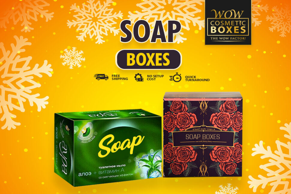
To design unique and visual-appealing Soap Boxes, it is essential to follow the principles of design. Designing packaging is different from creating artwork. Your design must have a purpose and it must communicate with the targeted audience. It is essential to make sure to design a solution that not only draws the customers but also converts them into your regular buyers. An effective design has a center of attraction or a point of focus to draw attention. If you think a packaging design is all about creativity, you are somewhat wrong. New designers and brands usually make the mistake of creating designs that are muddled or unfinished. They usually end up with a solution that is complex or just plain boring. Packaging design, like any other art form, adheres to some principles and rules. If you miss out on the balance, you will have an ineffective design.
Choose a Focal Point for Your Soap Boxes
The first design principle to follow is the emphasis. You need to choose a focal point for the design to let customers focus on it. The first piece of information you want to communicate should be your focal point. Outline in your mind to organize all the information. Layout all the design elements in a way that helps you communicate the most vital information effectively. If your brand name and logo are the most crucial elements, place them in the center of the Soap Boxes. Starting the design without any clear idea will not help to design a successful solution.
Balance and Alignment Is the Key to Design Soap Boxes
It is essential to keep in mind that every element you use in the design has a weight and size. Choosing the right size and weight is the way to design a balanced packaging solution. The weight refers to the color, size, and textures of the design elements. Just like you don’t arrange all the furniture in the corner of the room, you can’t use all the heavily designed elements in one place. Without a balanced design, it will be difficult for customers to look at the design for longer. It can give them a headache. Symmetrical design is the perfect example of balance. While designing Soap Boxes, you can place the heavy elements at the sides. Symmetrical designs are visually appealing and don’t give boring vibes.

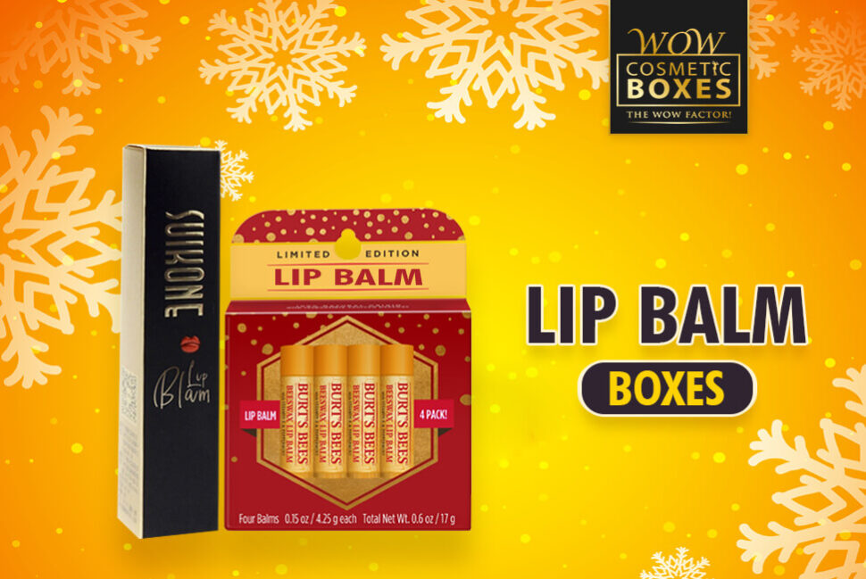
Lip Balm Boxes
Make Your Lip Balm Boxes Pop with Right Contrast
When we say a design pops, it means we are talking about contrast. The right contrast in the design can make your design and brand stick in the customer’s mind. Contrast is all about creating the difference and space between all the elements. You need to choose a different color background from the color of the items. It will create harmony and make the design understandable. Understanding contrast is the rule to design incredibly beautiful Lip Balm Boxes. How will you understand what is the most vital design element if everything looks the same? You can achieve contrast by using fewer elements in the design. Strong and effective design features one or two elements. Otherwise, you will make the design confusing.
Use Repeated Patterns for Visually Appealing Lip Balm Boxes
Repetition is the key to drawing the customer’s attention towards your product. Limiting yourself to fewer elements and choices is all you need to follow this rule. Repetition is the design that helps unify and strengthen your brand image in the crowd. If you are using more than one or two fonts for the Lip Balm Boxes, people will consider it as a mistake. Using a lot of colors in the design will also result in a failed design. You can design the soap packaging with beautiful illustrated patterns to impact the audience. Being consistent across all your brand channels is another form of repetition. Consistency is the key to letting customers identify your brand in the crowd without any hassle.

Custom Boxes
Choose the Right Proportion of Design Elements for Cosmetic Boxes
Another design principle to follow for a perfect design is proportion. A proportional design is all about choosing the right size and weight of the visual elements. It helps you divide the design into sections instead of presenting it as a whole. The first rule you need to follow for Cosmetic Boxes is to group all the related elements. You can achieve proportion in the design when all the design elements are properly-sized and creatively placed. Once you successfully applied the above four rules, the proportion will emerge organically. A proportional design help to communicate with the targeted audience more effectively. Without the right proportion, your design will fail to make a lasting impression.
Use White Space Wisely To Design Cosmetic Boxes
All the design principles are all about what you should add to the packaging design. Use of the white space is the only principle that refers to what you should not add. White space is the empty area around the elements. For designers, it is one of the most crucial aspects to focus on. Using white or negative space effectively gives more room to breathe and can make your design successful. White space is not about leaving enough empty room in the composition. You have to be creative in using the space for hierarchy and balance. Well-designed Cosmetic Boxes engage your audience with the design, and white space is a crucial part of it. You can use the space to communicate your ideas creatively.

