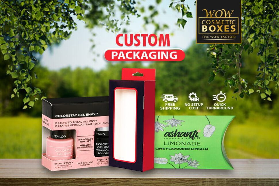
We all have noticed the trend of minimalist packaging design growing faster in the past few years. It is hard to ignore it as more and more businesses are sharing their tips for a simple yet elegant design. Whether you should go for a straightforward design or the vibrant one can also depend on your product and targeted audience. As we are entering 2022, we can’t overlook how being minimal is getting more and more crucial in the Custom Packaging industry. If properly executed, a minimal design can help make a positive first impression on the potential customers. Reducing the design elements can make your product look more elegant and subtle. Minimalist design is not about eliminating the design elements, but it is about being precise and focused.
Emphasize Your Brand Logo While Designing Custom Packaging
Custom packaging without a minimal design has a lot going on. It is hard for customers to focus on one element. Using several colors, extra fancy fonts, a lot of text, and complex shapes can make customers ignore your product. The minimalist approach is to keep the design as simple as possible. It will make it easy for the customers to understand your message and what you want to communicate. Take a look at the design of some big brands, and you will notice that the only emphasized element in the box’s design is the company logo. Using a one-colored box with your logo can give your product an elegant and sophisticated look. Customers should know the company name in only one look.
Only Focus on What Is Necessary to Deliver the Brand Message
If you truly want to share the minimalist style with the customers, it is essential to identify what is not necessary. Eliminating the unnecessary elements can help you focus on the message you want to deliver. Let’s say you are selling a cosmetic product. The first thing you need to include is the company name and logo. The next thing is the use of one or two colors. Using too many colors can distract the attention. What other information do customers need to make the purchase decision? Include the product name and its benefits to the custom packaging. Nobody has time to stand in the stores and read the long paragraphs. Make sure to use the relevant information.
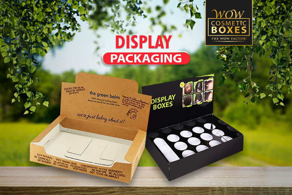
Give Some Thought to the Color Choice for Display Packaging
Colors play a crucial role in the design of custom Display Packaging. Brands need to spend some time making the color choice for minimalist design. If you are using a wide range of colors, it is time to exclude some of them. Many designers choose to use a simple color palette for a simple yet meaningful look. Most of the hues you will see in a minimal design are subtle and natural colors. Some shades of grey, simple black and white are some of the most used colors in the packaging designs last year. If you don’t know how color works for a minimal feel, you can work with an expert to choose the right options.
Add a Transparent Window to Your Custom Display Packaging
One of the finest approaches is to add a die-cut window to your custom boxes for a minimal appeal. There is no need to add unnecessary images to the design. Adding a transparent window on the top of Display Packaging will be more impactful than using a product image. More and more businesses are taking this approach to prove their honesty. It can help you win customers’ loyalty with a little effort. One of the key benefits of a semi-transparent solution is to let the product speaks for itself. You don’t need to put the images or text to convince the customers, and it also saves the printing cost. Your customers can see for what they are paying, and it will build their confidence.
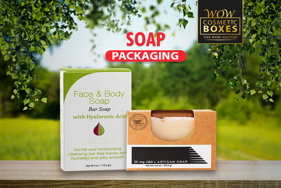
Use a Minimal Amount of Material to Design Soap Packaging
If you want to take a more sustainable and minimal approach to custom soap packaging, it is time to reduce the material usage. Many customers who prefer online shopping only have one complaint; unnecessary packing material. Using a box that is too heavy or too large will only result in disappointment. Anything excessive will only contribute to the environment. The beauty of a minimal design is you eliminate all the excessive elements and only focus on what is necessary. There are many other benefits oy using less material despite being minimal. It generates less waste and cuts down the material cost. You can make more sustainable choices, and it is easy for you to recycle the material.
Make Excellent Use of the White Space for Soap Packaging
One of the primary features of the minimal design is the excellent use of white space. It is time to let your fight your fear of having extra blank space on the custom Soap Packaging. Use a smaller area to add all the essential elements. It will let customers focus on the message you want to communicate. Negative or white space is the pillar of the minimal design, and you need to use it wisely. The rule is to add more negative space around an element to draw more attention towards it. You must use it creatively for maximum impact. The right approach is to create a balance between the white space and the elements.
