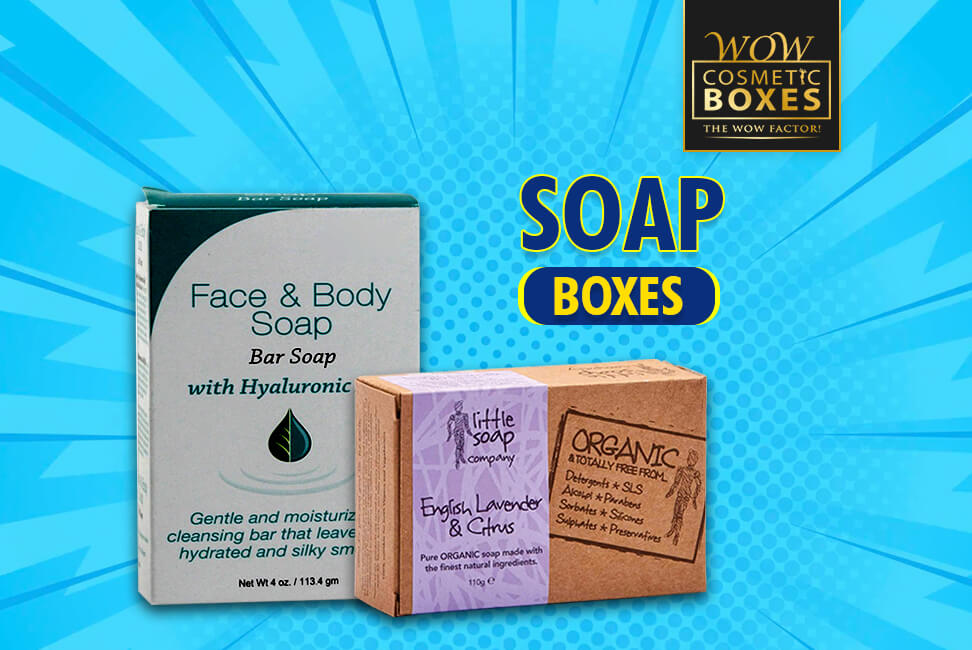
Are you tired of cluttered soap packaging? Do you crave simplicity and elegance in your everyday life? Look no further!
In this article, we will explore a collection of minimalist soap packaging designs that will inspire and captivate you. These clean and simple designs embrace the power of less, showcasing minimalist labels, eco-friendly solutions, and creative use of white space.
Get ready to be amazed by the latest minimalist packaging trends in the industry.
Key Takeaways
- Clean and simple packaging designs: Sleek, white boxes with minimal adornments convey elegance and sophistication, while highlighting the product’s quality and purity.
- Minimalist labels and logos: Simplicity, bold typography, and clever use of negative space create visually striking appeal, adding elegance, sophistication, and modernity to the packaging.
- Eco-friendly packaging solutions: Biodegradable materials, recycled paper or cardboard, and reusable containers reduce waste and appeal to sustainability-minded consumers, making a positive impact on the planet.
- Creative use of white space: Emphasizing the product, enhancing typography, creating balance, and capturing attention with a clean and minimalist look, maximizing the impact of minimalist soap packaging design.
Clean and Simple Packaging Designs For Natural Homemade Soap
Clean and simple packaging designs can inspire you with their minimalist approach. Imagine a bar of soap wrapped in a sleek, white box, adorned with nothing more than a small logo and the product name.
The clean lines and uncluttered design speak volumes, conveying a sense of elegance and sophistication. The simplicity of the packaging allows the focus to remain on the product itself, highlighting its quality and purity.
The use of neutral colors and minimal text creates a sense of calm and tranquility, inviting you to indulge in a moment of self-care. These minimalist designs not only catch your eye but also evoke a feeling of simplicity and purity, making them a perfect choice for those seeking a clean and minimalistic aesthetic.
Minimalist Labels and Logos For Soap Bar Boxes
As we delve into the realm of minimalist labels and logos, let’s continue exploring how these simple designs can seamlessly complement the clean and simple packaging aesthetic.
Minimalist labels and logos not only add a touch of elegance to soap packaging, but they also convey a sense of sophistication and modernity.
Here are three key characteristics of minimalist labels and logos that inspire and captivate:
- Simplicity: Minimalist designs embrace the less-is-more philosophy, using clean lines and minimal elements to create a visually striking appeal.
- Typography: Bold, sans-serif fonts are often used in minimalist labels and logos to make a strong statement and ensure legibility.
- Negative Space: The clever use of negative space in minimalist designs adds depth and visual interest, allowing the product to stand out.
With these minimalist labels and logos, soap packaging can achieve a refined and contemporary look.
Now, let’s move on to explore eco-friendly packaging solutions.
Eco-Friendly Packaging Solutions For Soap
To continue the exploration of minimalist soap packaging designs, let’s now delve into eco-friendly packaging solutions.
When it comes to being environmentally conscious, soap brands are stepping up their game. Imagine a soap bar wrapped in a biodegradable, plant-based material that decomposes quickly, leaving behind no harmful residues.
Picture a packaging made from recycled paper or cardboard, reducing the need for virgin materials and minimizing waste. Visualize soap bars nestled in reusable containers, encouraging customers to refill them instead of throwing them away.
These eco-friendly packaging solutions not only reduce carbon footprint but also appeal to the increasing number of consumers who prioritize sustainability. By opting for these packaging options, soap brands can make a positive impact on the planet while still delivering their products in an aesthetically pleasing manner.
Creative Use of White Space For Minimalist Soap Packaging Designs
Maximize the impact of your minimalist soap packaging design by creatively utilizing white space.
White space, also known as negative space, refers to the empty areas within your packaging design that don’t contain any text or images. By strategically incorporating white space, you can achieve a clean and minimalist look that captures attention and conveys a sense of elegance.
Here are three ways to creatively use white space in your soap packaging design:
- Emphasize your product: Allow white space to surround your soap, drawing attention to its unique shape, color, or texture.
- Enhance typography: Use white space to give your product name or slogan room to breathe, making it easier to read and creating a sense of sophistication.
- Create a sense of balance: Use white space to separate different elements of your packaging design, maintaining a harmonious and organized aesthetic.
By employing these creative white space techniques, your minimalist soap packaging design will stand out in the market and leave a lasting impression.
Now let’s explore some minimalist packaging trends in the industry.
Minimalist Packaging Trends in the Soap Industry
Now, explore the latest minimalist packaging trends in the industry that can inspire your soap packaging design.
Minimalism is all about simplicity and clean lines. One trend that’s currently popular is the use of earthy and natural colors, such as muted greens and browns, to create a sense of eco-friendliness and sustainability.
Another trend is the incorporation of geometric shapes and patterns, adding a modern and sophisticated touch to your packaging.
Using minimal text and relying on visually striking imagery can make your soap packaging stand out on the shelf.
And finally, the use of recyclable and biodegradable materials aligns with the growing consumer demand for eco-conscious products.

